Merlin’s weekly podcast with Dan Benjamin. We talk about creativity, independence, and making things you love.
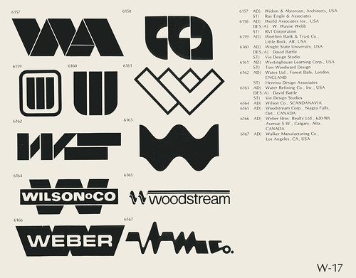
DesignVintage logo book scansMerlin Mann | Mar 18 2008Vintage Logos - a photoset on Flickr Wow, this is fun for you design and identity nerds -- 120 scanned pages from a book of logos that appears to be from the mid-70s or so (nb: the logos for the U.S. bicentennial and Montreal olympics are included). I'm immediately struck that you could present this many logos in literal black and white; it's amazing how many logos today fall apart if you remove the colors or (God forbid) the gradients. Kinda Related: if you're a logo nerd, monitor (43f site designer) Chris Glass's "design" tag for running coverage and commentary on the (d)evolution of logos over the years. Highlights: "Accepting change," "roundy, 3d, swoosh and twirl," "dog eared," "Another one bites the dust," and "CBS, 2007." [via: Metafilter] read more »7 Comments
POSTED IN:
Grids, The Rule of Thirds, and Rethinking Slide PresentationsMerlin Mann | Dec 31 2007I received my contributor copy of Garr Reynolds's Presentation Zen book last week and proceeded to devour it over the weekend. A fuller review is coming to this space soon, because this is the book about presentations that's needed to be written for years, and it's just fantastic. Best of all it's not another recipe book about "how to make slides" -- this is about re-imagining how your entire presentation will work together as a persuasive and integrated show, from conception through delivery. Awesome. Anyhow, with my inaugural Macworld talk looming on the horizon (T-minus 16 days, thanks), I've been inspired by Garr's book (and the top-notch site on which it's based) to, among other things, try revamping the approach to how slides fit in to my overall show. As I said on the Twitter, that starts with shit-canning the PowerPoint-y Keynote templates I've previously torn up and pasted together for stuff like Inbox Zero (here's the slides for that one, which Garr was kind enough to feature in his book). But, now, rather than strictly trying to reinvent the wheel, I have a quest. A quest for a crazy-simple, design-centric Keynote template that's more about composition than gradients and 3-D bullet points. Ever heard of The Rule of Thirds? read more »POSTED IN:
|
|
| EXPLORE 43Folders | THE GOOD STUFF |


